Home Focus at Hickeys —
Bringing consistency to a beloved Irish retail brand
How to take years of historical assets, retain a distinct heritage, and convert it all into forward-looking brand guidelines? With a brand identity and colour scheme in use for many years, Home Focus lack cohesive branding direction, leading to inconsistencies between stores, advertising and online use. As one of Ireland's leading soft furnishings fabrics and accessories retailers, with eighteen shops nationwide, a consistent presentation is essential.


Fabricating a mix of old with new.
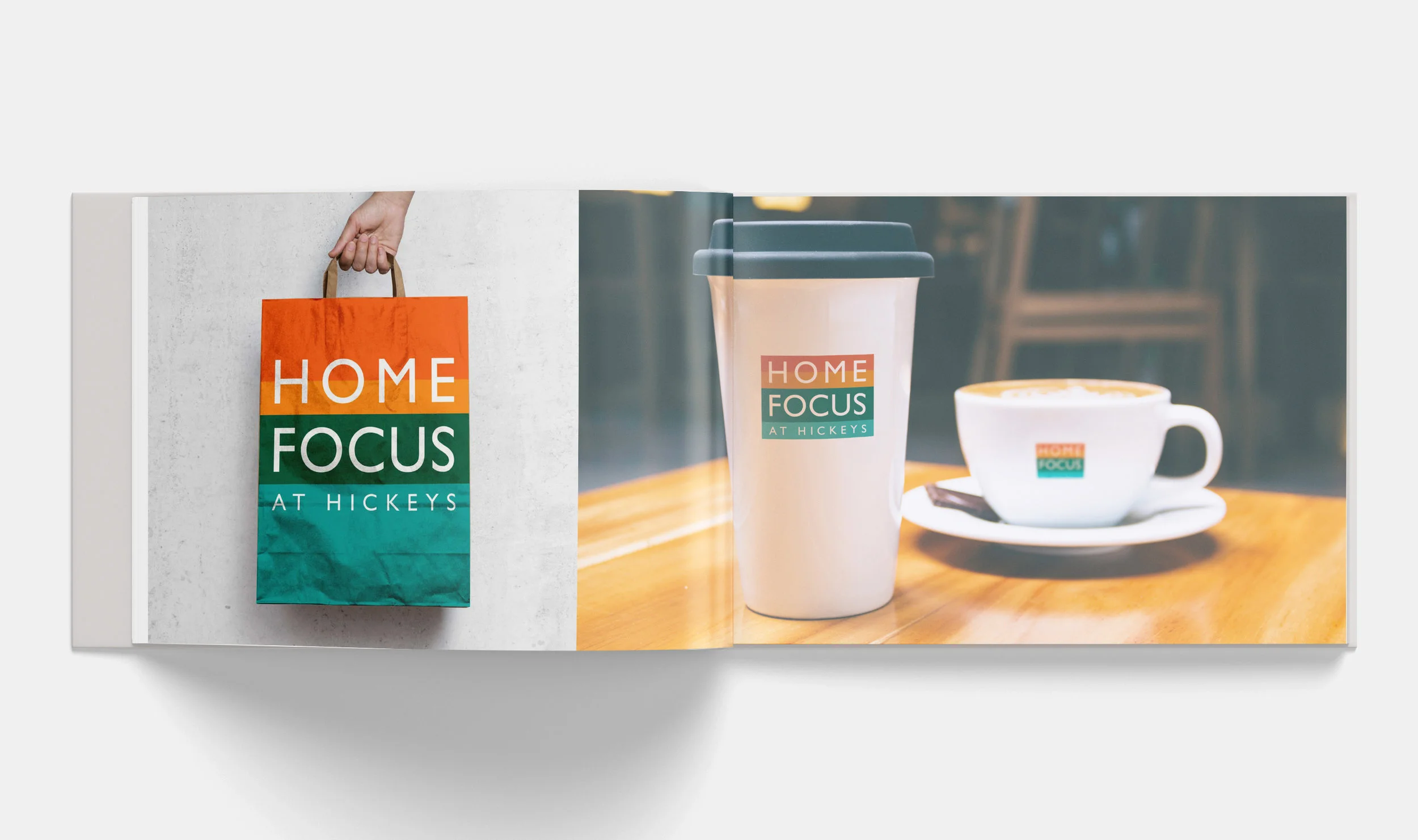
We reviewed historical assets including posters, advertising, brochures, signage, web and social media content. The first step included tweaking and cleaning existing logos and brand elements to create a structured and defined system of colour use. This was followed by an elegant typographic style guide and grids for a variety of media and in-store use. We also provided an art direction guide for product and lifestyle photography as an essential part of the system, delivering both the technical and emotional requirements of the client's photography and illustration.
To capture the modern feeling demanded for the brand to progress, in conjunction with the client's input we designed brand colour schemes with the purpose of producing an emotional reaction in the target audience appropriate for the time of year, including fresh colours for spring, warm for summer, wholesome for autumn, and a comforting Nordic colour set for winter.
A Brand Guideline Book, running over 100 pages long was the key asset produced, defining the brand parameters across Shopfront, Point of Sale, Accessories, Stationery, Digital and Broadcast media.